Decoration 101 : Colors!
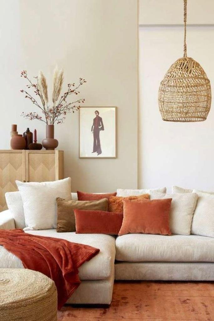
Cocooning vibe - Natural terracota hues
Credits: Cocon
Color is a crucial element in decoration, as in any artistic profession; it is what brings the work to life. Each person's sensitivity to color is different, and we do not all perceive the same shades. But don't worry, this is something that can be developed—our eyes can be trained to perceive more nuances. For example, there are 118 names for different shades of white (Titanium White, Ivory White, Off-White…), and no one could perceive them all!
Sensitivity to colors can depend on our vision (through the three cone cells that distinguish Red-Orange, Purple, and Green), on light (since color cannot exist without light, our place of residence and the season can therefore alter our perception), but also on our age (before the age of 18, the human eye generally prefers warm colors, as a reference to early childhood when we easily distinguish the color red), and finally on experience (on average, adults can distinguish up to 1,000 shades, whereas a painter or colorist can distinguish between 10,000 and 20,000)!
When we break down white light (thanks to Isaac Newton’s prism), it contains all the shades from infrared to ultraviolet. Newton’s second prism then recomposes these colors, and we see white light again.
From Primary Colors to Fundamental Ones, the Formation of the Color Wheel
Primary, secondary and tertiary colors
We all know the primary colors, those that allow us to create all other colors by adjusting their combinations, with white being the sum of all colors and black the absence of color. These three primary colors are Blue (Cyan), Yellow, and Red (Magenta). In photography, we refer to RGB: Red (Vermilion), Green, and Blue-Violet. These are the Fundamental colors.
Through subtractive synthesis (by mixing pigments, as in painting), the primary colors allow the creation of all other colors and shades. However, for photography, we use the fundamental colors with additive synthesis (through light waves) to achieve the same result.
When we mix two primary colors in equal parts, we obtain a fundamental color, or a secondary color. Mixing a primary color with a secondary color produces a tertiary color. These color mixtures form a color wheel. Complementary colors are found opposite each other on the color wheel. A complementary color enhances the initial color, making it stand out. For example, red will appear more intense when placed next to its complementary color, green. Similarly, the complementary color of a warm hue is always a cool one. This helps us determine which colors to pair. To create contrast, we choose complementary colors for our design. Conversely, for a soft unity, we opt for two colors that are adjacent on the color wheel (e.g., tone-on-tone or shades of the same color).
We can also play with the purity of a color. The more a color is mixed with another, and thus moves closer to white (which, as a reminder, is the combination of all colors), the less pure it is considered. If we want to add vibrancy to a space, we lean toward a purer color (like Klein Blue or Vermilion Red). If we seek softness, for instance in a child's room, we prefer pastel shades that are mixed with white.
In decoration, as in painting, color harmony is achieved through the balance of their proportions. To maintain interest, we avoid using two colors in equal parts. We choose a dominant color, then one or two supporting colors as a background.
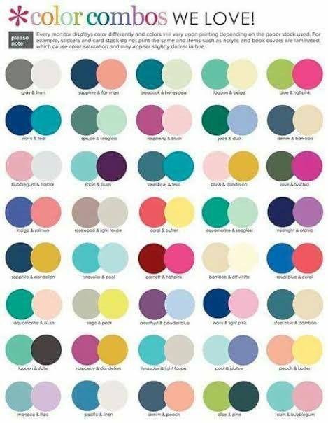
Here are a few combinations we find appealing:
Color combinations
II. The Color Chart: Creating Harmony in Decoration
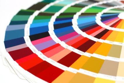
First of all, a color chart is a non-exhaustive catalog of colors. These colors are reproduced on various materials (paper, wood, metal, etc.) to provide a visual reference, and each is assigned a unique identifier.
As of today, there are five recognized color charts in Europe: Pantone, BS (British Standards), HKS, NCS (Natural Color System), and RAL. However, each brand or company can also create its own color chart to showcase the colors of their products.
Be cautious with online color charts, though, as the display on your computer screen can (and will!) distort the colors.
RAL Color Chart
In decoration, we use the color chart to define our colors early in the project, particularly when creating the mood board. This involves selecting 5 to 6 colors to incorporate into the project. This will provide a clear direction for choosing materials as well as decorative objects, ensuring overall harmony. As you can see, the mood board is a powerful tool for guiding the decoration, and essentially, it’s about choosing the main style (Bohemian, Wabi-Sabi, Japandi, Retro, Industrial...), textures, and of course, colors! And above all, if you’re about to start decorating, don’t skip this step! It’s often the lack of a mood board that causes us to get lost in the numerous choices available.
As one of my design teachers used to say: 'There are no ugly colors, only appealing or failed color combinations.' Depending on the décor we desire, we have several directions for choosing colors. Either we bring together similar tones and create chromatic gradients (color, value, or saturation gradations), or we choose contrasting tones, complementary colors that will visually balance each other. Here are a few non-exhaustive ideas for color choices:
The Pop of Color: Choose tone-on-tone colors and incorporate a contrasting color in small touches.
Multicolored Decor: For a rainbow effect, define at least the three primary colors, as these are the purest opposites. The farther we move from these pure colors, the less contrasted the effect will be.
Complementary Contrast: As we saw earlier, selecting two opposite colors on the color wheel (complementary colors) creates perfect harmony for the eye, as each brings out the other and neutralizes the whole.
Warm-Cool: More flexible than complementary contrast, this approach pairs a warm color with a cool color. In Feng Shui, this method is highly appreciated as it balances Yin and Yang.
Light-Dark: Instead of focusing on color, this technique plays with the values of a single color. It offers an interesting way to manipulate the volumes of a room.
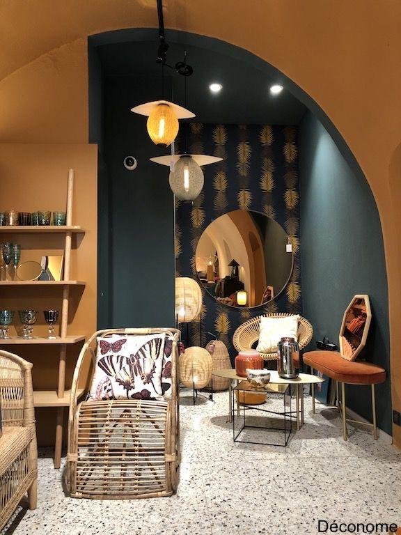
Highly colorful interiors!
Credits : ArchZine / Clem around the Corner / Déconome / LILM
The choice you make in color harmony cannot be wrong, as taste is subjective. In fact, color harmony is largely defined by the socio-cultural context of an era. When working with color professionally, as an interior decorator would, we cannot rely on arbitrary or whimsical judgment. The choice must be guided by a given theme (hence the importance of the mood board!). This avoids superficial speculation or impulsive inspiration.
Colors can also be used to play with space and volume. For example, dark colors can add interesting depth to a room, but if overused, they can make the space feel oppressive. Natural colors (white, gray, terracotta, etc.) are typically used as a base and create a sense of spaciousness. While cool tones like blue and green promote relaxation, warm tones encourage sharing and communication.
Moreover, the color associated with an object can give a specific tone to the decor. For example, painting a cannon pink instantly adds a touch of humor. On the other hand, a statue of a pig or a clown painted entirely black will remain chic despite its initial meaning. Every color carries strong symbolic value, which, when used wisely, can add that distinctive touch to a space.
Whatever your color choices, don’t forget the basic rule: no more than three colors in a single room. The colors should not be used in equal amounts: there should always be a dominant color, a secondary color, and a third used sparingly in small accents. This keeps the room’s decor interesting.
III. The Use of Color in Spaces and Their Symbolism
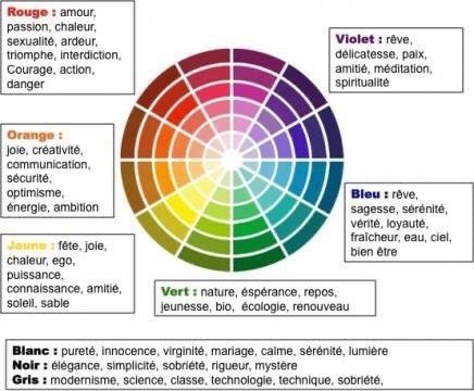
As mentioned earlier, each color carries symbolic meaning, and its use should be determined by the function of the space in question. For example, red symbolizes passion, prohibition, and strength, making it suitable for a romantic room but not for an office where calm and focus are needed. Here are some more specific insights for each primary and secondary color:
Colors Symbolism
Blue: Rest, sense of space
Green: Zen, evokes nature
Purple: Meditation
Orange: Creativity and sharing, dynamism
Yellow: Activity, planning
Red: Power, strength, passion
Depending on the chosen harmony and colors, our eyes will focus on different aspects:
Monochromatic decor around a single shade allows us to play with materials. Our gaze will be particularly drawn to these different textures.
Contrasting decor will shock the eye and draw attention to specific objects. This is ideal for directing focus to a precise point.
Seeking balance involves choosing shades that are close on the color wheel, creating a sober and harmonious space under any circumstances.
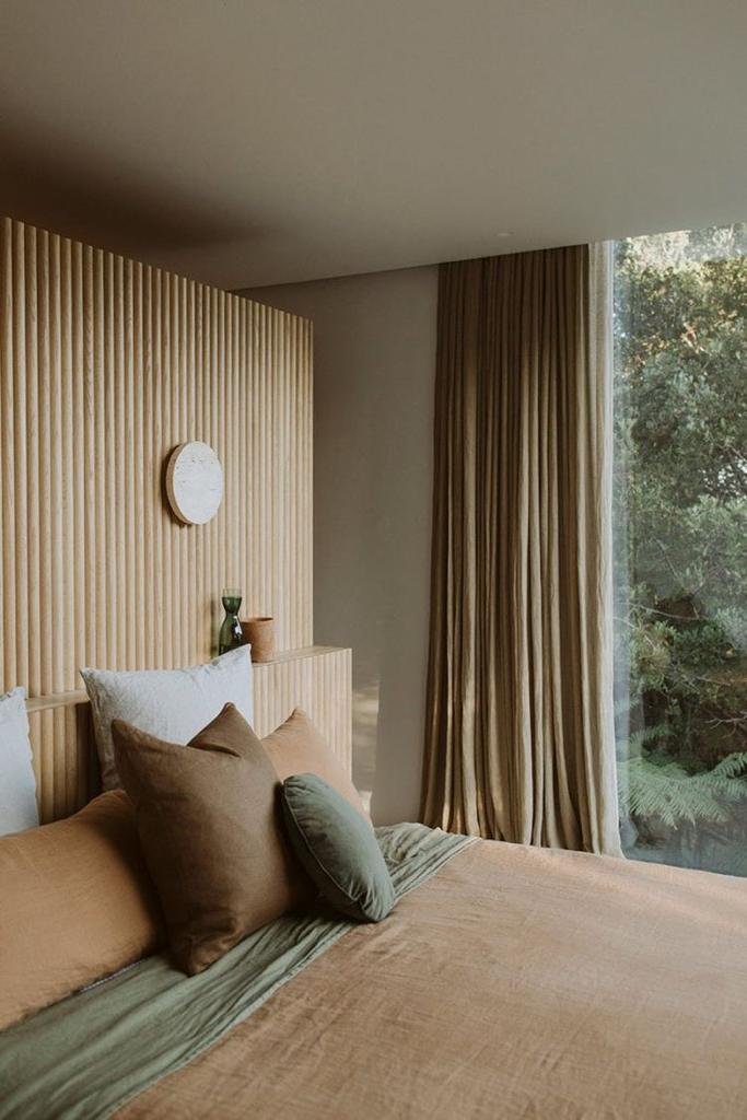
Currently, the Nature trend remains popular, as seen in styles like Wabi-Sabi, Japandi, and Hygge. For this, we will use neutral, natural shades like sand, stone, or brown, which are found in natural materials such as wood. The aim is to create a sense of continuity between the outside and inside of the home.
Bedroom with natural colors
Credit: DforDesign
We will then aim to add a touch of character, for example, by incorporating a splash of vibrant color through a painting, cushions, or small decorative objects, which will give a modern and stylish touch. Alternatively, we can stick to pastel colors for a soft and gentle interior. Each person has their own theme, vision, and, above all, their own tastes!

